UI Design project
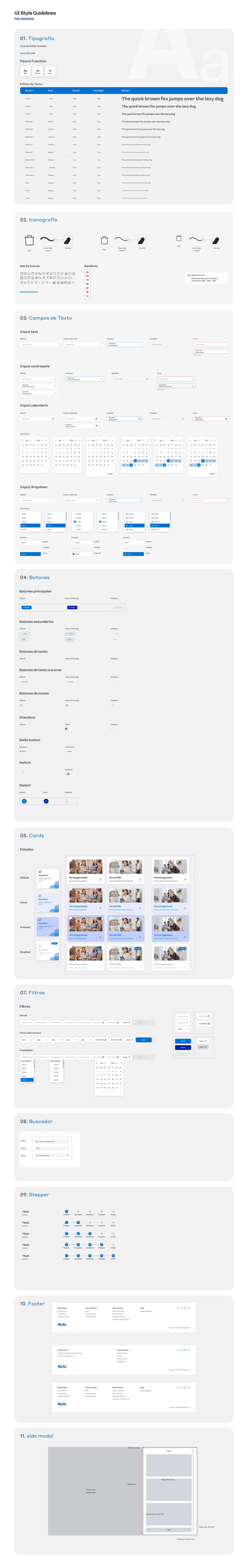
A guideline document sample
The company faced multiple visual styles across the product, creating inconsistencies and slowing down design delivery.
Create a scalable design system to unify visual language, improve efficiency, and facilitate collaboration between design and development.
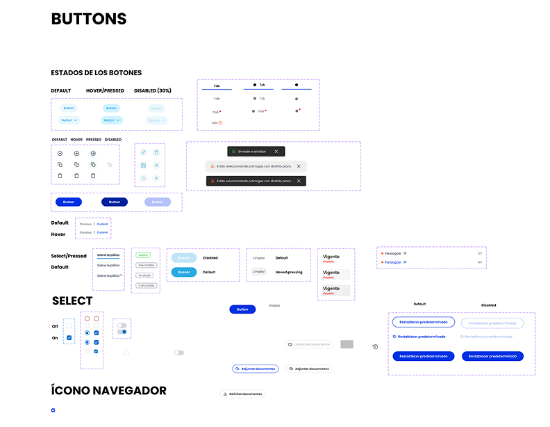
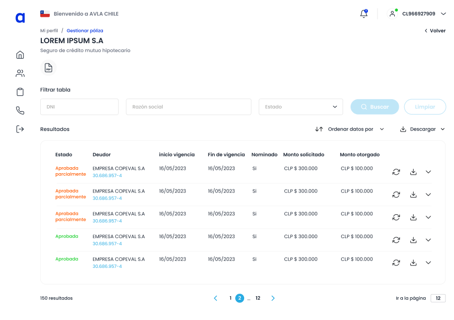
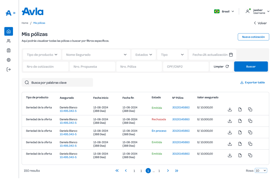
The big problem was that we had many components with different styles, which were mixed together over the years in different projects.
We begin by looking at our current portals, what components we have, what we don't have, and what we need to change. With that, we organize a foundation from which we can begin to define and structure.
Old components
With a defined structure, we began to hold brainstorming sessions, unify concepts, and capture them in Figma.
So that the entire team understands and can read it, we document each component as follows:
We validated the components with real use cases, ensuring usability, accessibility, and consistency across devices. Feedback from developers and users refined the final interactions.
For implementation, I collaborated with developers to integrate the Design System across different products, using tokens and clear documentation for scalability. The system became the single source of truth, reducing design-to-development friction and ensuring product consistency.
Old view
New view
This project went beyond creating a Design System. It established a scalable foundation that improved collaboration, reduced inconsistencies, and accelerated the design-to-development workflow. By aligning design and engineering, the system became a single source of truth that not only enhanced current products but also set the stage for future growth and innovation.