Process
How to boost team productivity by removing friction and fixing usability pitfalls.
Artemisa is the main portal for managing credit insurance operations. Underwriting, Billing, and Policy Issuance teams use it daily to handle policies, premiums, and client validations. However, combining multiple roles and processes in one place can create friction. The original system’s fragmented workflows and confusing screens cause delays, errors, and extra workload.
This project breaks the portal into user profiles and redesigns each flow to improve usability, speed, and adoption. Key tasks will be centralized, components standardized, and the design made consistent for scalability. The current focus is on streamlining daily tasks for Operations and minimizing friction.
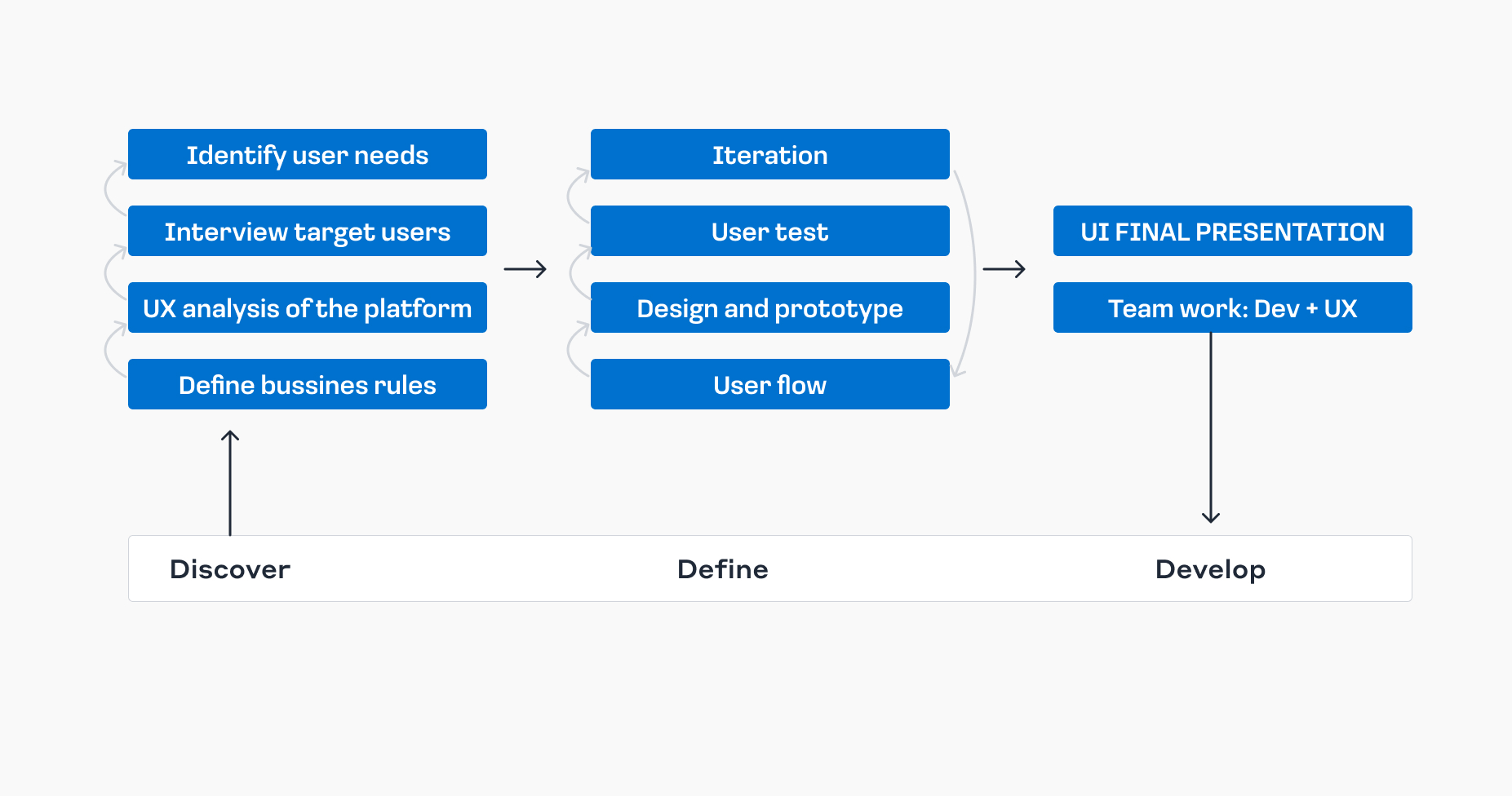
We assessed current processes through user interviews, flow analysis, and co-creation workshops. Based on this, we designed modular solutions with clearer navigation, streamlined flows, and validated user needs. All improvements were supported by a new design system to ensure consistency and scalability.
We laid down some principles based on UX research findings, based on which we structured the entire redesign.
To reduce the learning curve and minimize errors, we defined clear patterns for placing key elements and actions.
We restructured the information architecture, prioritizing what’s essential on each screen.
The design is supported by a library of reusable components, making it easier to evolve the product and for the development team to adopt.
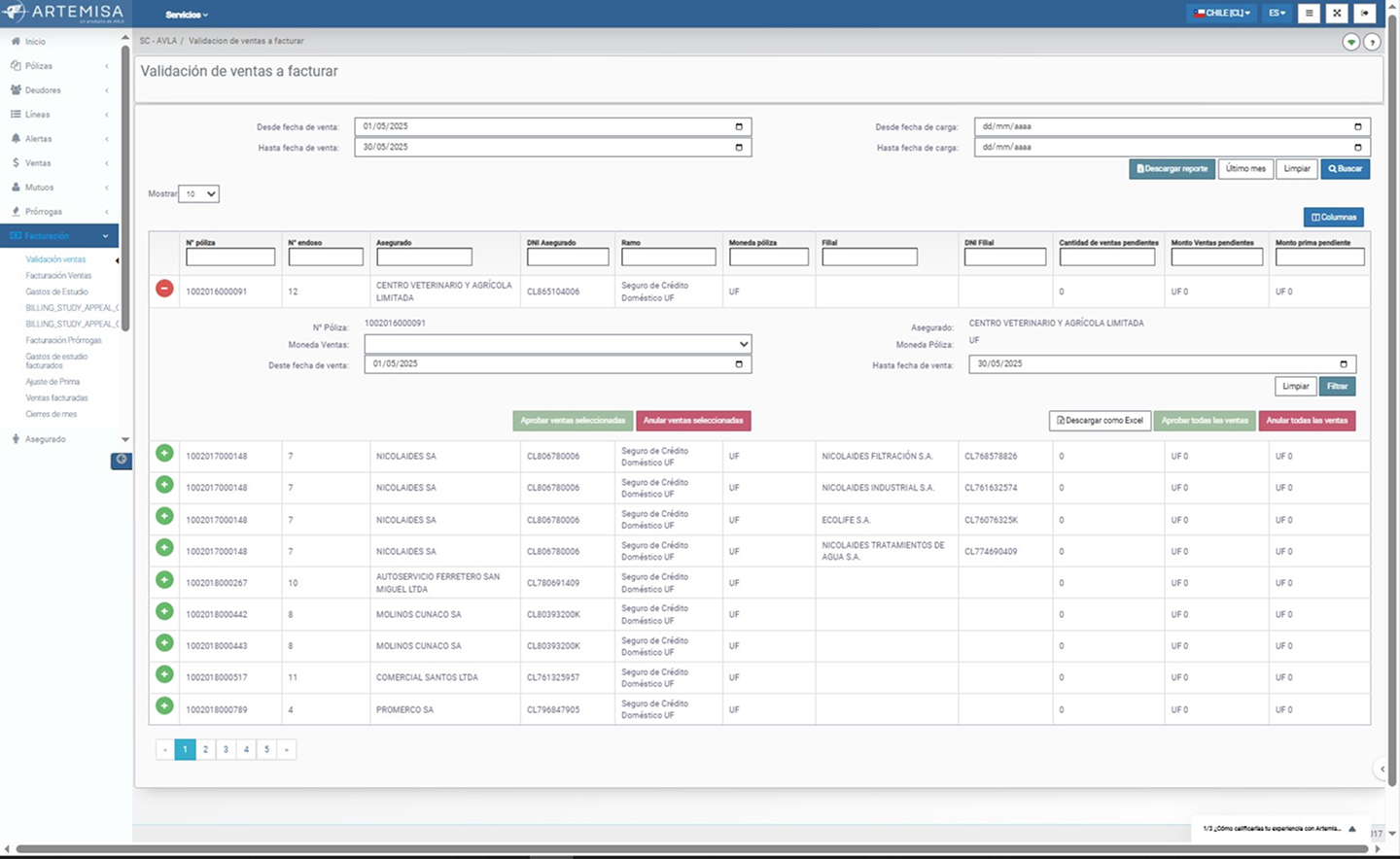
The old views
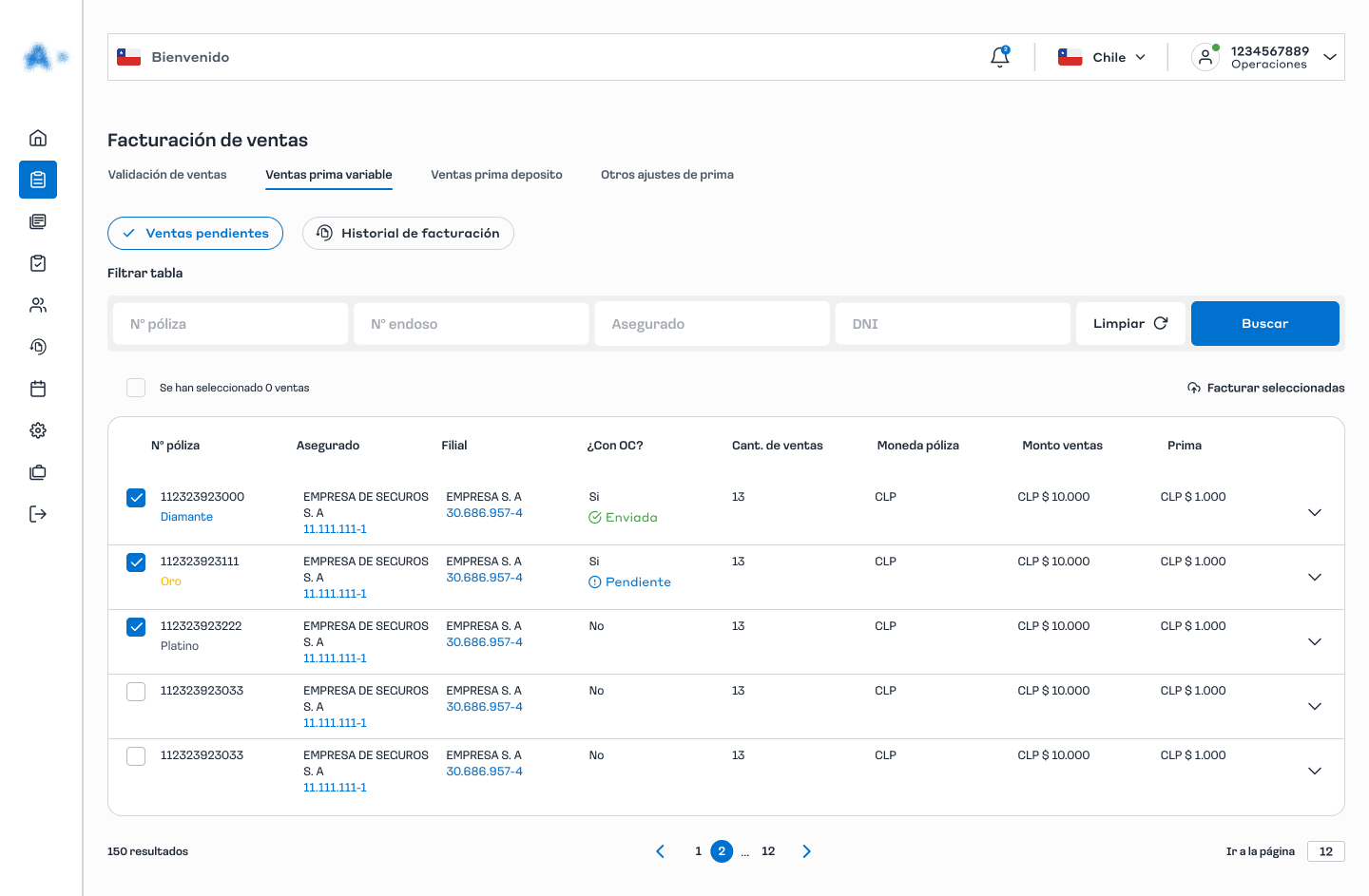
The new view
Like many other processes, the billing flow was disorganized and scattered across different sections of the platform, causing confusion and unnecessary steps. We redesigned it by grouping everything into a single centralized module, making it much easier to manage the entire process from start to finish in one place.
Main actions, such as invoicing or re-invoicing sales, created a lot of friction and frustration because, in some cases, they were hidden inside tables and, in others, required cumbersome external processes (like emailing Excel files to support). To solve this, we centralized all these key actions in a sidebar modal, making them more accessible, dynamic, and easy to find.Additionally, this solution frees the tables from unnecessary information, keeping them cleaner and clearer for daily operations.
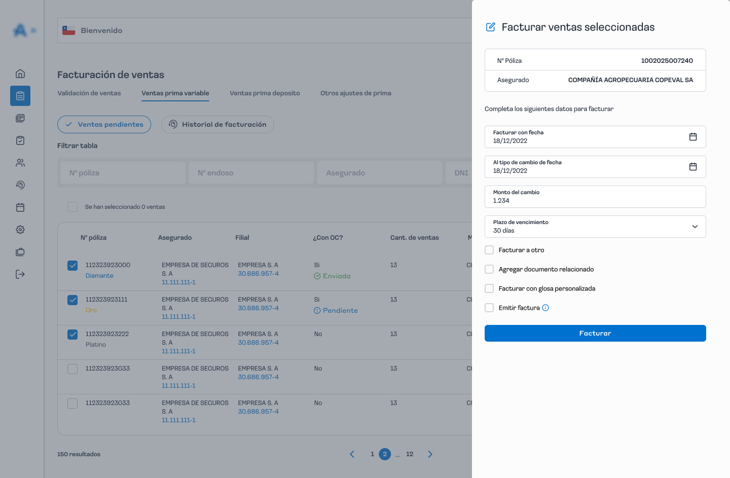
The new component
The new flow
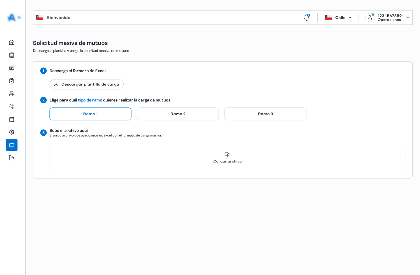
Having to complete tasks outside the platform was one of the main pain points for users. For example, to fulfill a bulk data request, they had to send at least two emails and wait up to two days for a response. We redesigned this flow to eliminate external steps, enabling the entire process to be completed in three clear steps within the portal and resolved on the same day.
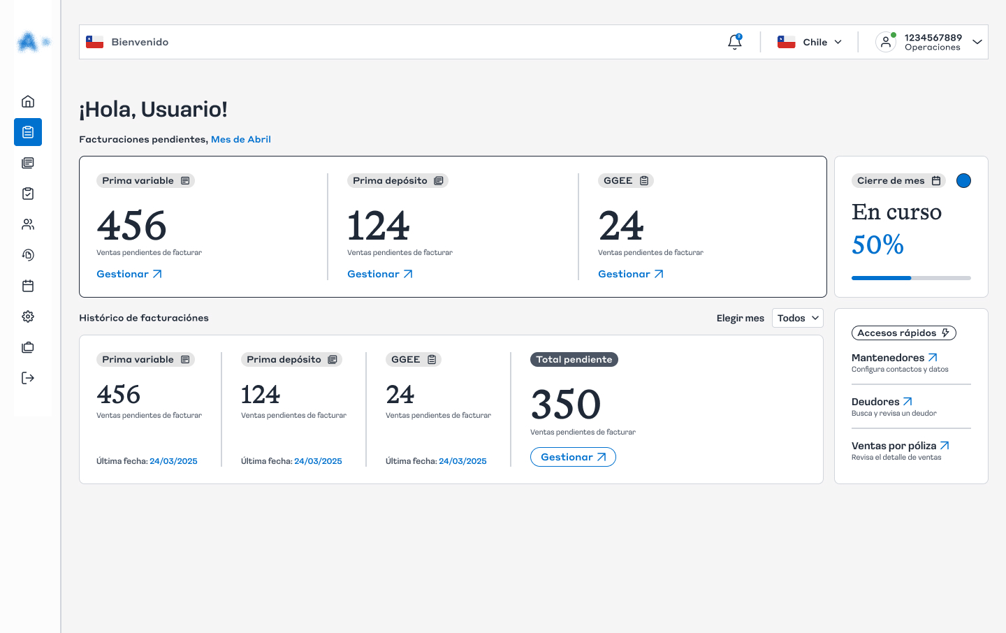
One of our key value propositions is to transform the home page into an operational dashboard that consolidates all key information for the user in one place. The goal is for each person to instantly see their pending tasks with real-time updated data, and have quick shortcuts to manage critical processes without unnecessary steps. This way, users always know how much work remains, can prioritize better, and optimize their time more efficiently.
Think out of the box
Leading the end-to-end redesign and successfully launching the updated portal was a key achievement for me. This new solution improved operational efficiency, reduced user friction, and centralized critical workflows, impacting daily tasks across multiple teams. The project strengthened collaboration between UX, development, and business stakeholders, and reinforced the importance of user-centered design in complex enterprise systems. Seeing the positive feedback from users and the increased adoption of the platform reaffirmed the value of focusing on usability and streamlined processes.
