Process
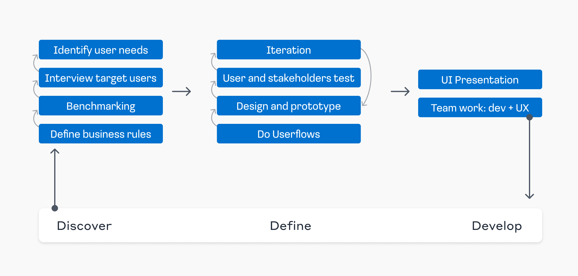
Discover
Define business rules
Research (Who are the users? What is the product? What are the goals?)
Benchmark
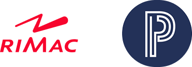
We benchmark our competitors, Rimac and Pacifico, to evaluate best practices and identify potential user needs.
Interview target users
We conduct interviews with users and stakeholders to identify their needs and motivations, while gaining valuable insights into our target audience—professionals with higher education, aged between 30 and 60.
Identify needs and motivations
Based on user interviews, we gathered valuable insights regarding key expectations and needs. Users highlighted the importance of agility and ease when generating quotes, emphasizing the need for a streamlined process with minimal steps. Additionally, they expressed the need for features and accessibility options tailored to older users, ensuring the platform is intuitive and user-friendly for people aged 30 to 60. These insights have been instrumental in guiding our design decisions, allowing us to prioritize simplicity, efficiency, and inclusivity in the platform’s user experience.
Define
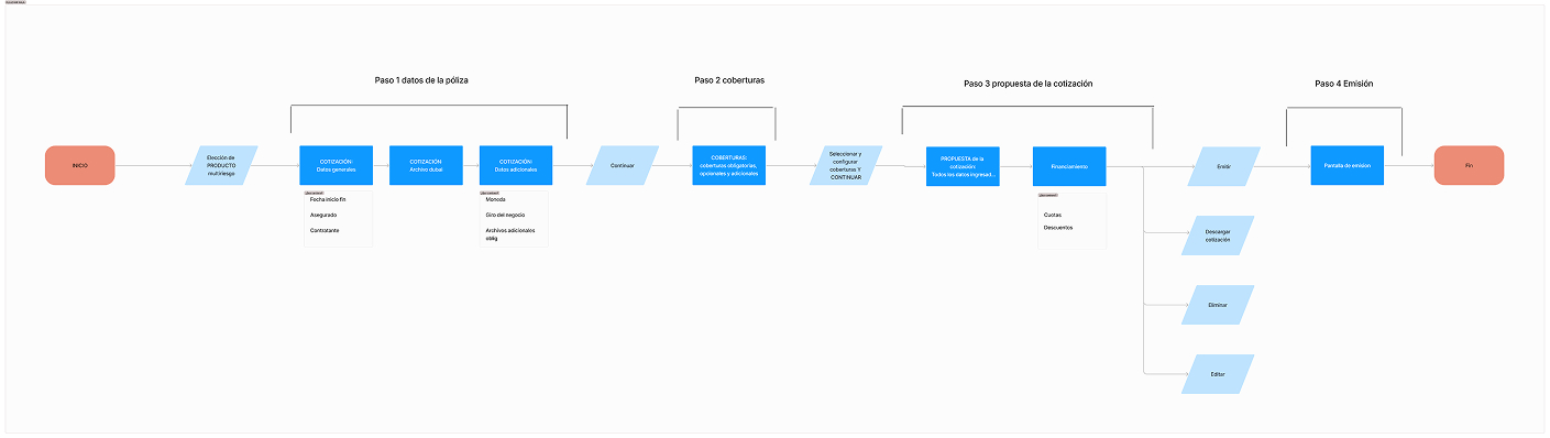
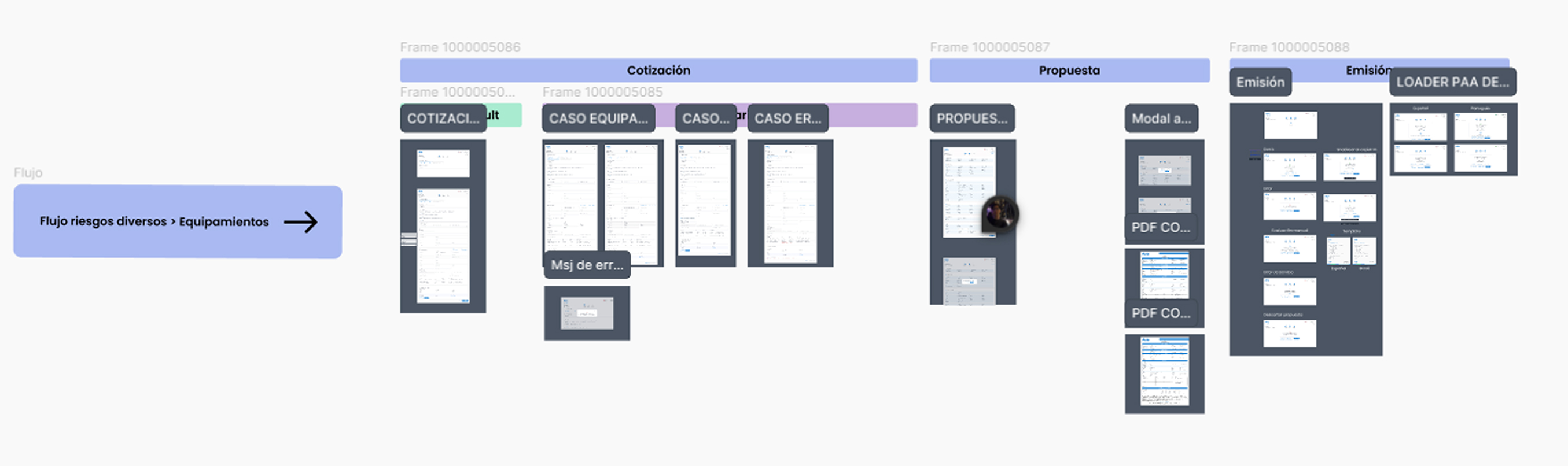
User flows and site architecture
With the information gathered, we began designing the user flows and site architecture using flowcharts
Design and prototype
With a solid structure in place, we began designing the main user flows in Figma with high quality and fidelity for version 1.0. Our goal was to develop an interactive prototype to later test with users, allowing us to gather valuable insights and identify areas for improvement.
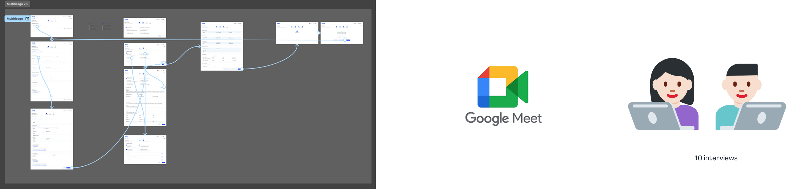
User and stakeholders test
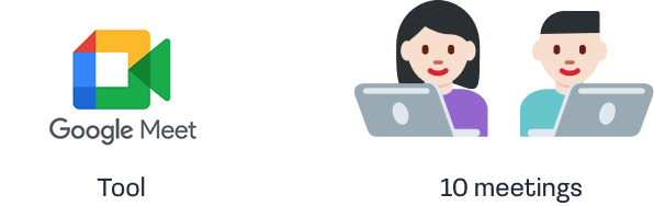
We conducted a total of 10 user meetings, where participants were provided with a Figma prototype link and asked to complete specific tasks, such as navigating a flow or performing an action. Additionally, we requested comprehensive feedback on accessibility and functionality. Based on the insights gathered, we iterated and made several key adjustments to improve the user experience.
Iteration
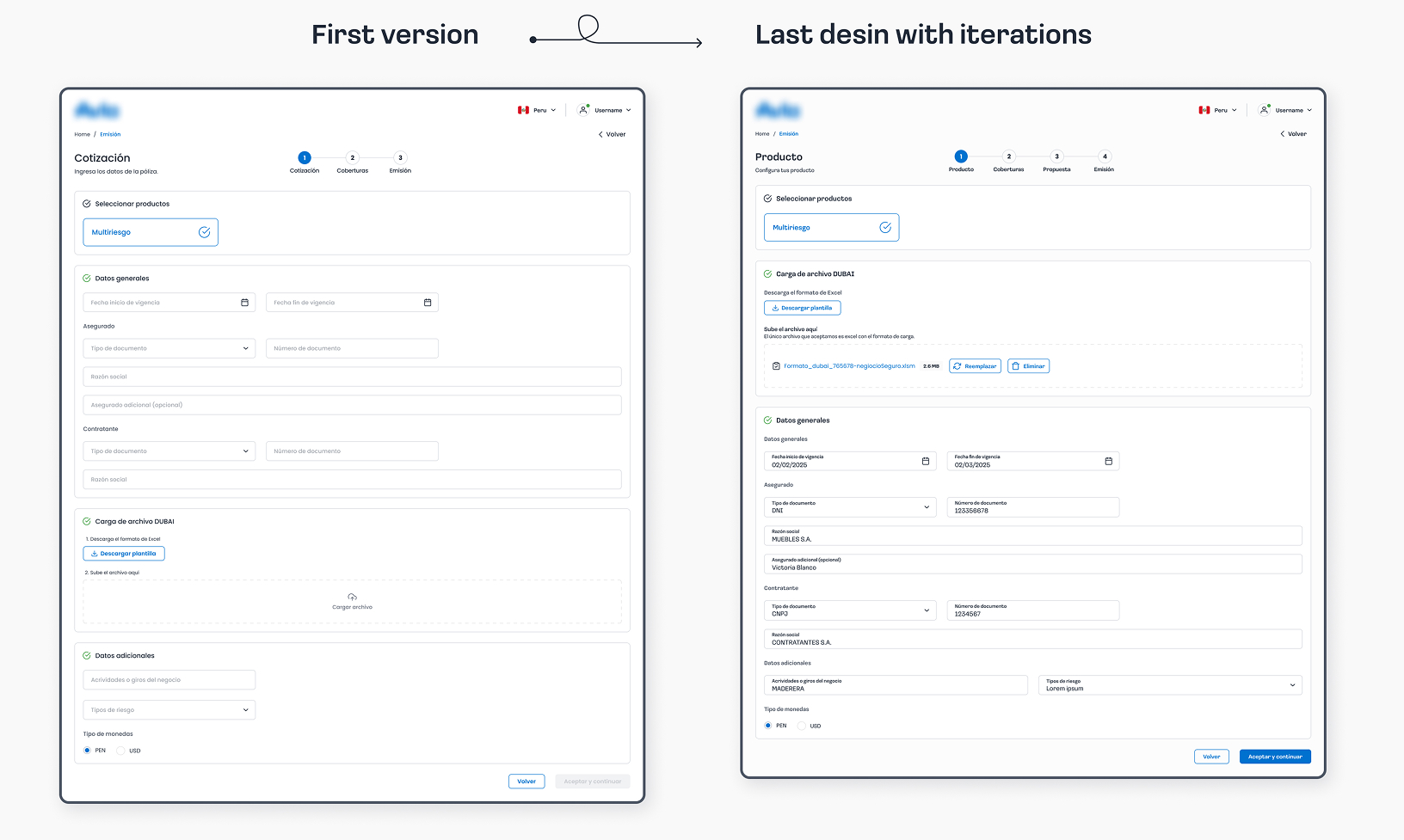
Here is a screen from the main flow (issuing a policy), where some of the key changes we implemented based on user insights are highlighted.
In terms of accessibility, we increased 2px the font size for input fields and subtitles, and changed the background color from #fff to #fcfcfc to create a softer, more eye-friendly contrast.
Additionally, we introduced an extra step to make the process feel more fluid and interactive. We also significantly streamlined Step 1, the most critical part of the flow, where automation through document upload proved to be a key improvement.
Develop
Currently
The platform has been successfully launched as an MVP and has already issued its first policies. We continue to work on adding new features and user flows to enhance the platform's functionality and user experience.
.jpg)
.jpg)
.jpg)
.jpg)
.jpg)
.jpg)
.jpg)